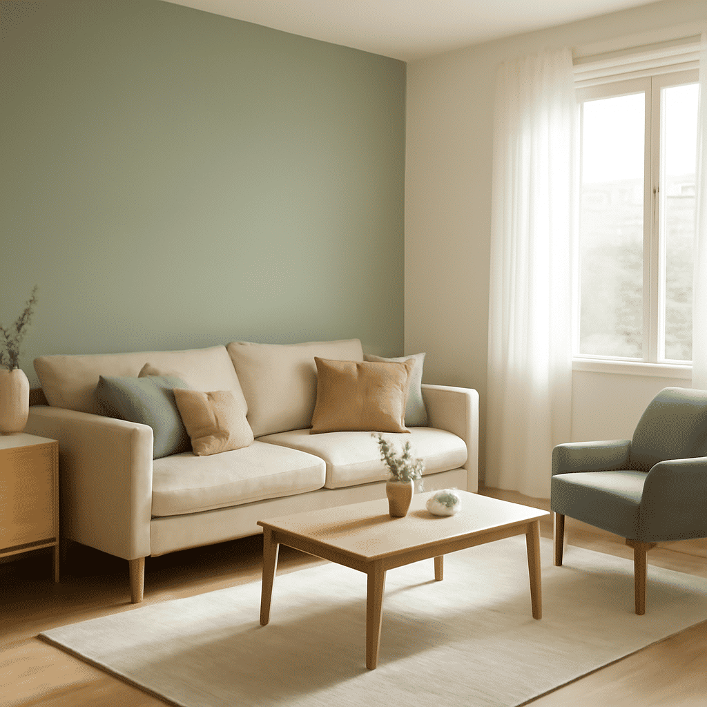
Creating a harmonious interior color scheme can transform your living space into a cohesive and inviting environment. The right color palette not only enhances the aesthetic appeal but also sets the mood and tone of the home. Here are some expert tips on selecting and combining colors to achieve visual balance.
Understanding Color Palettes
Begin by familiarizing yourself with the color wheel, a tool that outlines primary, secondary, and tertiary colors. Primary colors, such as red, blue, and yellow, form the base, with secondary colors like green, orange, and purple being mixtures of two primaries. Tertiary colors are a blend of primary and secondary colors, offering a broader spectrum to play with.
Utilizing Nature’s Palette
Nature is an exquisite guide for combining colors. Look at landscapes: the blues of the sky, the greens of foliage, and earth tones provide a natural template. Incorporating these shades can create a serene atmosphere within your home.
Choosing a Dominant Color
Decide on a dominant color that will set the overall tone of the space. This color will cover significant areas such as walls or large pieces of furniture. Ensure it aligns with the ambiance you wish to create—soft, pastel tones for tranquility or bold hues for vibrancy.
Selecting Accent Colors
Accent colors are essential for adding contrast and character. They should complement the dominant color and are best used in smaller elements like cushions, vases, or artwork. A good rule of thumb is the 60-30-10 rule: 60% of a dominant color, 30% of a secondary color, and 10% of an accent color.
Exploring Monochromatic Schemes
A monochromatic scheme involves variations of a single color. This approach is ideal for achieving a sophisticated look. Experiment with different shades, tints, and tones to add depth and interest to the space without overwhelming it.
Trying Complementary Colors
Complementary colors are opposite each other on the color wheel. Pairing them brings balance as they enhance each other's intensity. Consider a blue and orange pair for a dynamic look or purple and yellow for something unique.
Considering the Effects of Light
Natural and artificial light can alter how colors appear. Test swatches at different times of the day to understand how these changes impact the space. Use lighter shades to reflect light and make rooms appear larger, while darker shades can create a cozy, intimate feel.
Balancing with Neutral Colors
Neutral tones like white, gray, beige, and black provide a versatile background, making other colors stand out. These hues are ideal for balancing bold palettes and ensuring the space doesn’t feel overwhelming.
Personalizing Your Space
Ultimately, your color scheme should reflect your personality and lifestyle. Think about the emotions each color evokes and whether they align with your vision for the space.
In conclusion, mastering interior color schemes involves understanding color relationships, considering the effects of light, and balancing tones to create a harmonious environment. By experimenting with different palettes and trusting your instincts, you can create a space that is both visually appealing and uniquely yours.