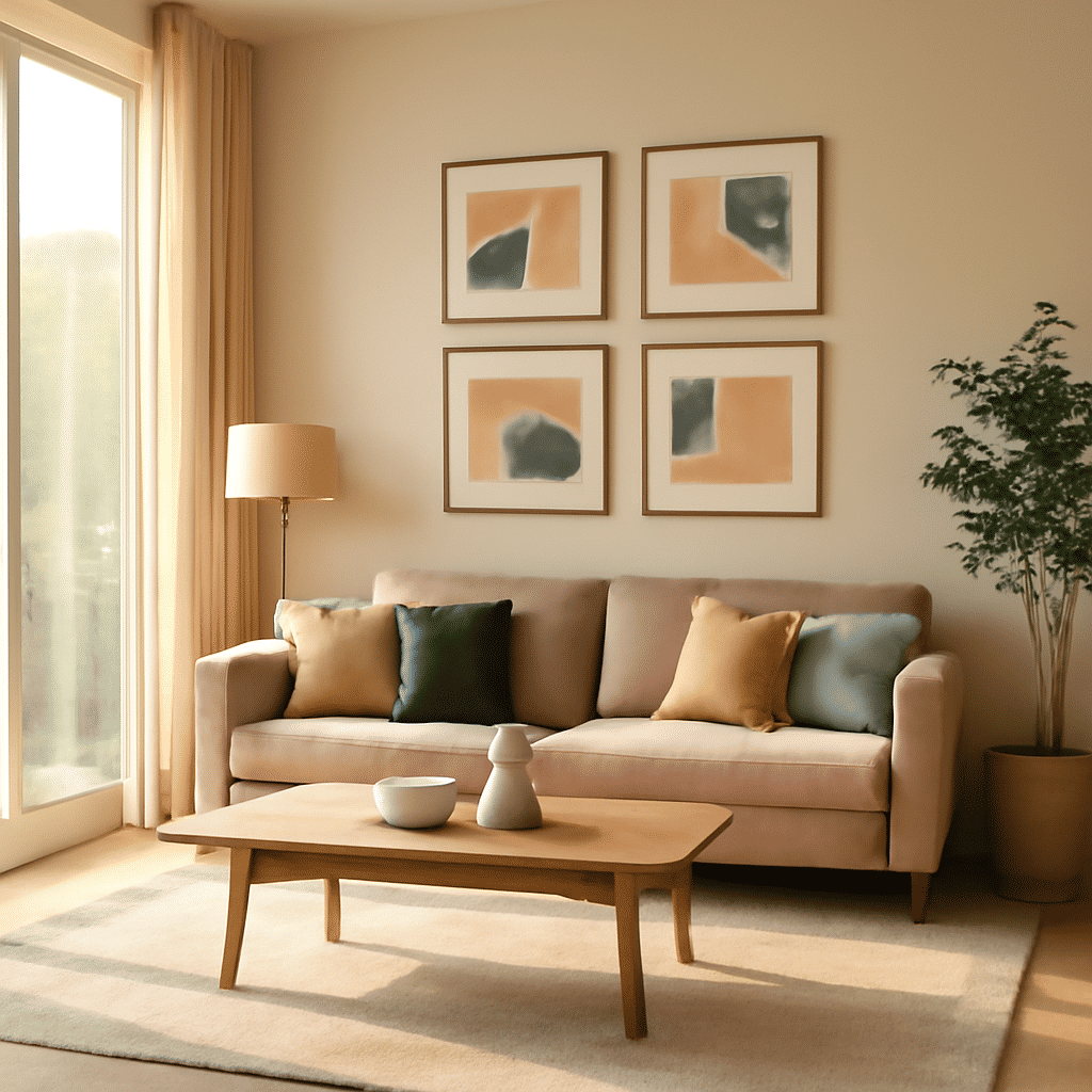
Creating a welcoming and elegant space through the use of color is not only a matter of personal taste but also of understanding how different shades interact with each other. When choosing hues for your interior, it's important to think about how they will blend to enhance the aesthetics of your home. Below are some tips to help you select and match shades that bring harmony and sophistication to each room.
Understand the Color Wheel
Starting with the basics, the color wheel is an essential tool in interior design. It helps you understand which shades complement each other and how to create balance. Complementary colors, located opposite each other on the wheel, can add energy and drama. Analogous colors, next to each other, produce serene and comfortable designs. Understanding the wheel gives you a foundation for making informed choices.
Choose a Dominant Hue
Select one dominant shade to set the stage for your interior design. This could be a bold, vibrant hue or a soothing, neutral tone. The dominant color often appears on the walls or large pieces of furniture, creating the primary atmosphere of the room.
Consider the Purpose and Mood
Think about the mood you want to evoke in each room. Cool colors like blues and greens are calming, making them ideal for bedrooms or bathrooms. Warm colors like reds and oranges can energize a space, perhaps fitting for a living room or dining area. Neutral shades such as grays and beiges offer versatility and can be accented with bolder colors for various effects.
Balance With Accents
Once you've chosen a dominant hue, balance it with accent colors. These can be introduced through smaller elements like throw pillows, artwork, or rugs. Accents should support and enrich the dominant color rather than overpower it. If your primary hue is very bold, neutral accents can offer a calming contrast.
Mind the Natural Light
Natural light changes how colors appear at different times of the day. Consider the direction your room faces and how much light it receives. Bright sunlight can intensify warm colors, while north-facing rooms might appear dimmer and can benefit from warmer shades to add coziness.
Test Before Committing
Before applying paint to your entire room, try samples. Paint small sections and observe them at various times of the day to see how light affects the color. This preliminary step ensures you are satisfied with the hue before making a full commitment.
Texture and Materials
The materials and textures in a room also affect how colors are perceived. Glossy surfaces reflect light and can make colors appear brighter, while matte surfaces can deepen them. Fabrics and finishes offer depth and variety that can complement or contrast with your color choice, adding richness to a room.
Create Flow with Adjacent Rooms
When planning your color scheme, consider how rooms connect. Smooth transitions between colors in adjacent spaces create a sense of harmony and continuity throughout your home. You don’t need to use the same hue in every room, but related tones can establish a coherent flow from one space to another.
With careful selection and thoughtful combination of colors, you can create a peaceful and elegant environment that reflects your personality and enhances your lifestyle. By understanding the basic principles of color harmony and considering the unique characteristics of your living space, you can transform your home into a sanctuary of style and comfort.